
Am I behind?
That is the real question underneath every net worth comparison, and net worth by age answers it as directly as the data allows: your figure, set against the national median for your age band, from the ONS wealth survey. It is the most emotionally loaded tool on this site, and the one where reading the answer correctly matters most. So before the comparison does anything to your mood, it's worth knowing what the number is actually made of.
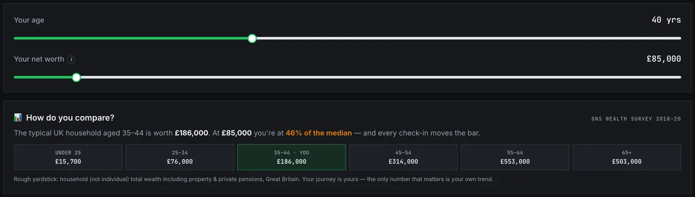
The average is a rich person's number
Which statistic you are looking at decides almost everything, and averages are close to useless for wealth. A handful of extremely wealthy households pull the mean far above what most people hold, and measuring yourself against it will make almost anyone feel behind when they are not. It's the old bar-room illustration: one billionaire walks in and the average customer becomes a millionaire, while nobody's account has changed by a penny.
Medians behave better. The median describes the middle household, half above and half below, and for wealth it typically sits far lower than the average for the same group. That is the meaningful comparison, and it is the one to insist on. If you meet a wealth statistic in the wild and it does not say which kind it is, assume it's a mean and discount it accordingly. Headlines prefer means for the same reason they prefer big numbers generally.
Two 40-year-olds, hundreds of thousands apart
Even the median hides the thing that matters most. Within any age band, the range is enormous. Two 40-year-olds can both be doing perfectly well and sit hundreds of thousands apart. One bought a house in 2012, the other rents in a city. One did a degree with no fees, the other carries student debt and started earning four years later. One inherited, the other quietly supports a parent.
A ratio to the median captures none of that, and most of it was never a decision anyone made. So someone sitting well below the median may be on a completely reasonable trajectory, and someone above it may be there for reasons unconnected to anything they chose. The distribution reflects starting positions and property timing at least as much as it reflects behaviour, which is why it works as rough orientation and fails as a scoreboard.
Take the three positions in turn. Below the median is common and rarely as bad as it feels. The dominant factor for most people is time and property: someone at 32 with a negative net worth built from a student loan and a new mortgage is not failing, they are at the point in the curve where the numbers look worst. The line matters more than the level, and the net worth tracker gives you the view that actually predicts anything. Near the median means what being near the middle of any very wide range means, which is not much; the middle is not a target and says nothing about whether your own plan works. And above the median deserves less celebration than it usually gets. National medians are low. Clearing one tells you nothing about whether you are on course for the retirement you actually want, and being ahead of a distribution while behind your own plan is entirely possible. It is also considerably more important.
Why your thirties feel like failure
Net worth by age is not a straight line, and once you see the shape of the curve, much of the anxiety the comparison produces simply evaporates.
Your twenties are frequently negative, and legitimately so. Student debt arrives before earnings do, there has been no time for compounding, and whatever you can save is heading toward a deposit rather than into investments. A negative figure at this stage carries almost no information about how things will turn out.
The thirties bring the steepest change for most people, and the least comfortable stretch. A mortgage converts a deposit into equity but adds a very large debt at the same moment, so the net figure can move sideways for years while a great deal of progress happens underneath it. This is the decade where people most often conclude they are failing, usually while doing everything right.
Then compounding starts to show its face. Through the forties, mortgage capital repayments accumulate, pensions have had time to grow, and the line usually steepens without any change in behaviour at all. By the fifties and sixties the absolute gains are the largest of the whole run, because percentage growth now applies to a substantial base. Someone whose net worth barely moved through their thirties can add more in one year at 55 than in a decade earlier.
The bands you are compared against each contain people at different points on that curve. Which is exactly why where you stand at 33 says so little about where you will stand at 53.
The comparison that actually answers the question
The comparison people want is not against other people. It's against their own future, and that needs different tools.
The savings rate calculator gives you the percentage of income you keep, which predicts your timeline far better than any current balance. Unlike net worth, it reflects what you did this month rather than everything that has ever happened to you, which makes it both fairer and more actionable. The FIRE calculator goes a step further and converts what you hold and what you add into an age; that number answers "am I on track" properly, because it is measured against your own spending and your own goal rather than a stranger's. And the net worth tracker records your figure monthly so you can see direction. Direction is the only thing here you control, and the only thing that compounds.
One honesty note about the benchmark itself belongs here too. Net worth figures are difficult to source consistently: definitions vary on whether pensions and property equity are included, surveys such as the ONS wealth statistics are periodic rather than current, and household figures behave differently from individual ones. Treat any benchmark as an approximation on the right order of magnitude rather than a precise ranking. That imprecision is one more reason to hold the result lightly: a tool that tells you where you sit against the typical household is interesting, but it is not a plan, and it has no view on whether the life you are building is the one you want.
If the answer left you discouraged, the useful next step is unglamorous. Work out what you actually spend (the ONS family spending survey shows what typical households part with, if you want a reference point), raise the gap between that and what you earn, and track the direction monthly. Those three things move your position; knowing where you rank does not. And if it left you feeling ahead, the same caution runs in reverse: a comfortable multiple of the median is evidence that national medians sit lower than people assume, not that your own plan works.