
Every retirement projection you have ever seen rests on one assumption so quiet that most people never notice it: you will be alive for the whole chart. Rich, Broke or Dead refuses to assume that, and the refusal changes what every number on the page means.
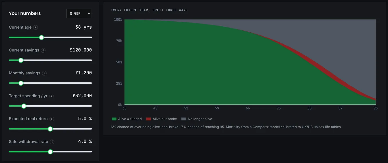
At each age it shows the probability of three states: still comfortable, out of money, or no longer here.
Why the third state belongs on the chart
A conventional simulation reports something like "8% chance of running out over 40 years", the success-rate framing the original Trinity study made standard. True, and incomplete. A meaningful share of those failures happen at ages you have a substantial chance of never reaching.
Running out at 94 is a real risk. It is also a risk conditional on being 94, and for someone retiring at 55 the probability of both reaching 94 and having exhausted the portfolio is considerably smaller than the headline failure rate implies. Saying this doesn't make the risk disappear. It puts the risk in proportion, and proportion is exactly what's missing from any chart that treats a 40-year horizon as a certainty.
Two honesty notes before you take comfort from that. The mortality figures come from population tables, the same kind of data the Office for National Statistics publishes on life expectancy, and your own health, family history and circumstances may sit a long way from the average in either direction. So treat the dead band as a description of the population, never as a forecast about you. And running out is not symmetrical with dying. Being broke at 88 is a bad outcome even if it is briefer than being broke at 70; the chart shows probabilities, not how much each outcome would hurt, and it isn't trying to.
Watching the broke band
Three regions stack to 100% at every age. Rich, meaning alive with money remaining, dominates the early years and narrows gradually. Dead grows steadily with age and eventually dominates everything, because that is how mortality works.
Broke, alive with the portfolio exhausted, is the band to watch. It should stay thin, and where it starts thickening tells you which decade your plan is genuinely exposed in.
The useful reading is the relationship between the broke and dead bands rather than any single value. If broke only becomes significant at ages where dead is already large, the plan is in reasonable shape. If broke grows meaningfully while most people are still alive, there is a problem worth fixing. The chart is blunt in a way that spreadsheets are not, and the bluntness is the point: retirement planning is about a life of finite and uncertain length, and models that ignore this produce a specific, predictable bias.
One thing the shapes will never show you is care costs. Later-life care is expensive and arrives precisely in the years the chart paints as increasingly unlikely to be reached, so the scenario where you live longest is, a little ironically, also the one where spending may rise sharply. Hold that thought whenever the late-age broke band looks reassuringly thin.
The retiree nobody writes articles about
Conventional planning is built around not running out. Taken to its conclusion, that means saving until failure is nearly impossible, which requires such a wide margin that you will very likely work years longer than needed and die with a large unspent sum.
That is a real cost. It is simply an invisible one, because nobody writes articles about the retiree who over-saved and worked four unnecessary years.
Seeing the dead band grow makes the trade-off visible. There is a genuine question about whether the marginal year of work is worth the marginal reduction in an already-small failure probability, and for many people, once they can see the shape, the answer is no.
Unless a bequest matters to you. If it does, dying with a large balance is a success rather than waste, and the whole framing shifts: the dead band stops being an argument for spending and becomes the region where the money you leave behind lives. The chart ignores anyone you leave money to, so that intention is yours to hold alongside it.
One more year, then another
There is a well-documented pattern in early retirement circles: people reach their number and then work one more year. Then another. The number was met years ago and the leaving never happens.
The reasons are understandable. Markets might fall. The pot could be a little larger, the margin a little wider. Each individual year is a small, sensible-sounding decision.
This chart is the clearest argument against that sequence, because it prices the other side. Every additional year buys a marginal reduction in an already-small failure probability, and spends a year from the section of the chart where the rich band is widest: the healthy, active years when the money would have been most enjoyable.
Nobody can tell you where the line sits. But seeing the dead band grow while the broke band stays thin is a reasonable prompt to ask whether the extra margin is still buying anything you actually want.
Come here last
Build the plan in the FIRE calculator first, then check its robustness the usual way: the Monte Carlo simulator for how often it survives, the crash test for a shock at the worst moment.
Then come here, once you have a plan that works and are deciding whether to keep adding margin. This is the tool for that question specifically, and it is the only one on the site that will tell you when to stop saving.
If the broke band is thin across every age you have a realistic chance of reaching, more saving is buying very little. If it thickens early, the fixes are the familiar ones: flexibility first, since agreeing to spend less in bad years costs almost nothing in good ones (see the withdrawal strategies tool), then a lower starting rate, then more years of work.
The chart's real contribution is permission. Most retirement content is built to make you save more, and there is a point past which that advice stops being in your interest. This is a way of finding roughly where that point sits for you.
One caveat on reading it that way, and it echoes the population-table warning from the top. The chart makes a strong case for stopping, and it makes that case using averages that may not describe you at all. Someone with a family history of longevity, or in good health at 55, is looking at a dead band that overstates their own odds, and for them the broke band matters more than the chart suggests. Use it to check whether additional saving is still buying something, not as evidence that it never was.