
Which of your assumptions would hurt most if it turned out to be wrong?
Most people can't answer that, and it shows in where their planning energy goes. A retirement projection has perhaps six inputs, and they do not carry equal weight. Some can be wrong by a fair margin without moving your date much. One or two will move it by years, and the FIRE sensitivity tool exists to tell you which is which. It starts from your base plan, takes each input in turn, moves it up and down by a realistic amount for that dial (10% for the money inputs, a full point for returns, a quarter of a point for the withdrawal rate) while holding everything else constant, and records how far the FIRE date shifts.
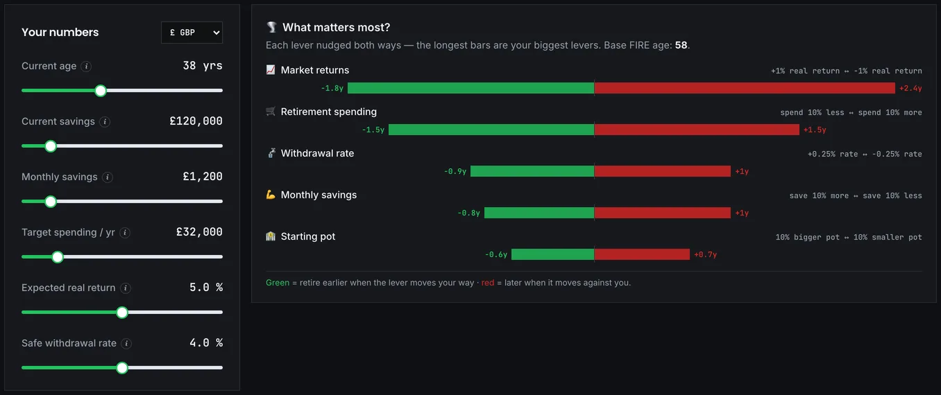
The result is a ranking. The inputs at the top are the ones your plan depends on; the ones at the bottom are close to irrelevant and not worth agonising over. And it is a different question from the one the Monte Carlo simulator answers, so it's worth separating the two before you start. Monte Carlo asks how often the plan survives an uncertain future. Sensitivity asks which assumption you should be most careful about getting right in the first place.
The ranking you'll almost certainly get
At typical inputs the tallest bar is market returns, and it is worth understanding why before drawing conclusions from it. The tool nudges each money input by 10% but returns by a full percentage point, because that is the size of error people actually make about markets, and a point off a 5% assumption is a fifth of the return. On the base plan below it moves the date by nearly two years. The bar is tall because the uncertainty is real, and you control none of it; the most you can do is anchor the assumption in the long-run historical record rather than in hope.
Retirement spending comes next, first among the inputs you can actually pull, at about a year and a half each way for a 10% change. Its bar also understates its real leverage: the tool moves only the target, holding contributions still, while in life a permanent spending cut frees money to invest as well, and counting both puts spending ahead of everything. Monthly savings lands third at around a year, the same lever seen from the other side. The withdrawal rate behaves like a scaling factor on the target: a quarter-point nudge shifts the date most of a year. The starting pot sits last; it helps, but on a long horizon contributions dominate what you start with. Retirement age and life expectancy are not bars on this chart at all, though they matter a great deal for whether the money lasts once you get there. If you're plucking that last figure from the air, the ONS life expectancy data is a better anchor than a round number and a hopeful shrug.
Notice the shape of that list. The tallest bar belongs to the one input nobody controls, and the two directly beneath it are fully yours. That split is the useful finding, and it is the opposite of where most people spend their planning energy.
One caution before you lean on any of this: the ranking is yours, not universal. Someone twenty years from retirement with a small pot gets a different order from someone two years out with a large one. Late in a plan, returns and sequence dominate; early on, contributions do. Run it on your own figures rather than trusting the general pattern.
A 10% nudge on every dial
Take a base plan: age 35, £120,000 invested, £1,500 a month, £32,000 of spending, 5% real, 4% withdrawal. That is an £800,000 target, reached just before 53. Now move each dial by the same 10% and watch the date.
Cut retirement spending from £32,000 to £28,800 and the tool pulls the date in by about a year and a half, to 51.5: the target drops to £720,000 and nothing else changes, because the target is all the tool moves. In real life a permanent cut does double duty, since the £267 a month you no longer spend can be contributed instead, and rerunning the plan with both changes lands at 50, nearly three years early. Raise contributions from £1,500 to £1,650 instead and you gain most of a year, to 52.1. A half-point of extra return buys the same, from an input you control none of, and the tool's own returns bar uses a full point, which is why it tops the chart at nearly two years. Grow the starting pot from £120,000 to £132,000 and the date moves half a year, the weakest dial of all, because over this horizon what you add dwarfs what you began with.
Same relative change, and roughly three times the effect from the spending dial once the freed money is redirected. That asymmetry is the finding, and it should shape where your effort goes.
Bear in mind what the clean ranking cost, though. Moving one input at a time is a simplification, because real changes arrive together: a promotion raises income and often spending too, and a market fall may coincide with job insecurity. The tool deliberately isolates each input, which is what makes the ranking clean and also what makes it incomplete. And sensitivity is not probability. An input can move your date enormously while being very unlikely to change; life expectancy is the clearest example. Read the ranking alongside how likely each assumption is to be wrong, not instead of it.
The exception hiding in the returns row
A great deal of energy goes into optimising returns: chasing the right fund, the right allocation, the right moment. The chart explains the temptation, because the returns bar is the tallest one on it, and then quietly undercuts it. You cannot make markets return more. You can change what you spend, and every pound of permanent reduction does double duty.
Fees are the exception worth taking seriously. They are a return input you do control, and they compound exactly as returns do. Cutting an all-in charge from 1.2% to 0.3% is functionally a permanent return increase, available immediately and with no risk attached. The fee impact calculator shows what that is worth over a full investing life, and it is usually the single largest controllable improvement after spending.
Better estimates, then a better plan
Take the top one or two inputs and improve the quality of those estimates before doing anything else.
If spending leads among the dials you control, and it will, the figure you're using deserves better than a guess. A few months of real entries in the Expense Diary will give you a number grounded in what actually left your account, and the reports separate what will continue in retirement from what will stop. Plans built on a guessed spending figure are guesses, regardless of how carefully everything else was modelled. If savings rate leads, the savings rate calculator shows how directly the percentage you keep maps onto years of working.
Then rebuild the plan in the FIRE calculator with the improved figures, and stress it with the crash test. Sensitivity tells you what to get right. Robustness tells you whether being right is enough.