
Here's a question that catches almost everyone. Who ends up richer at 65: someone who invests £250 a month from 25 to 35 and then never adds another pound, or someone who invests the same £250 a month from 35 all the way to 65?
Hold your answer for a few sections. The point of the question is that your intuition and the arithmetic will disagree, and the size of the disagreement is the whole reason the compound interest calculator exists. Human intuition is linear; compounding is not; the tool makes the shape visible.
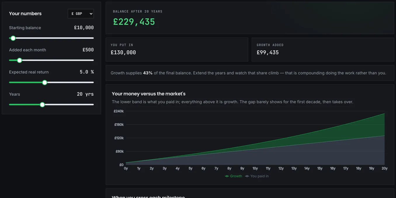
Four boxes, unevenly important
The form walks you through them in order, and they matter far less equally than the layout suggests.
Starting amount is what you already have invested today, and zero is a perfectly valid entry. The tool is arguably more instructive when everything comes from contributions, because then the whole curve is earned rather than inherited. Monthly contribution is what you add, and for most people under 40 this drives far more of the final figure than the starting amount does.
Annual return is the growth rate, and how you set it decides whether the answer means anything at all. It deserves its own section, and gets one below.
Years is the horizon, and it's the input with the most pull on the result. Every argument financial writing makes about starting early is really an argument about this box.
There is no compounding-frequency box, and the absence is deliberate. The tool compounds monthly at the twelfth root of your annual rate, so the rate you type is a true annual figure and no frequency choice can distort it. That also reflects how little frequency matters: monthly against annual compounding of the same nominal rate shifts a thirty-year outcome by a few percent, nothing like the difference a single point on the rate makes. The return box is where the agonising belongs.
Pounds you can picture, or pounds from 2056
The most common way to get a wildly wrong answer here is entering a nominal return against a target expressed in today's money.
Say you enter 8% because that's the sort of long-run nominal figure the historical record shows for equities, look at the result, and think "£620,000 will be plenty". You've just made an error worth years of your life. That £620,000 is in future pounds. After thirty years of 3% inflation it buys roughly what £255,000 buys now, and £255,000 may not be plenty at all.
Enter a real return instead, meaning nominal minus inflation, and the answer comes out in today's money, which is the only unit you can actually reason about. A projection in future pounds isn't wrong, just unreadable: nobody knows what £620,000 will feel like in 2056, and everybody knows what £255,000 feels like today. For a globally diversified equity portfolio a real return means something in the region of 5%, and less once fees are taken.
If you want to feel how hard inflation works against a fixed sum, the inflation calculator shows it directly, and the Bank of England's inflation calculator will do the same with actual UK price history rather than an assumed rate, which makes the point more brutally than any hypothetical.
The decade where nothing seems to happen
The output splits the final balance into what you contributed and what growth added, and that split is the most instructive thing on the page.
Over ten years, contributions dominate; growth is a modest topping. Over twenty, they approach parity. Over thirty or more, growth typically exceeds everything you paid in, often by a wide margin.
This is why the curve stays flat for so long before it bends. Early on, almost nothing is happening that feels like progress, and that stretch is precisely when most people conclude the whole thing isn't working and stop. The years that feel pointless are the ones doing the compounding that pays out later. If you take one idea from this page, take that one.
Once the base run looks sensible, start nudging it. Take a thirty-year run to forty and watch the final figure: the increase is far more than a third, because those last ten years compound on the largest balance you've ever held. Then put the horizon back and move the rate from 5% to 6% instead. The final figure grows by about a fifth, but the growth portion, the part the market supplied, jumps by more than a third, and that sensitivity is exactly why fees matter so much. A 1% charge is not 1% of your money; it's roughly a fifth of your growth. The fee impact calculator puts a figure on that over a lifetime, and the figure is uncomfortable. Finally, keep everything identical and simply begin five years later. The gap that opens is the single strongest argument for starting with a small amount now rather than a sensible amount later.
Back to the two savers
Now the opening question. Both invest £250 a month at 5% real.
The first starts at 25 and stops entirely at 35. Ten years of contributions, £30,000 in total, then nothing for thirty years. At 65 they hold roughly £167,000.
The second starts at 35 and continues to 65, thirty years of contributions, £90,000 in total. At 65 they hold roughly £204,000.
So the late starter does finish ahead, but look at the price. They paid in three times as much and finish only about a fifth ahead. The first person's £30,000 spent thirty years compounding; the second person's later contributions had barely a decade each. Run it yourself, then shift the first person's stop date a few years in either direction and watch what happens. The lesson isn't that contributing later is pointless (it plainly is not), but that early contributions are worth several times their face value, and no amount of later saving buys those years back.
The polite fiction in the smooth curve
Every projection on this page is a smooth line, and no real portfolio produces one. The final number is what you get if returns arrive evenly, which they never do, and for a plan you intend to withdraw from that omission matters enormously. The Monte Carlo simulator exists because of it.
The tool is also silent on tax: growth inside an ISA or pension is sheltered, growth in a general account is not, and the calculator doesn't distinguish. It assumes a flat monthly contribution for the whole period, when in reality most people's contributions rise with income, which makes the real outcome better than the projection. One of the few assumptions here that errs in your favour. And it knows nothing about behaviour. The projection assumes you never stop, never withdraw and never panic-sell in a downturn, and those three behaviours account for most of the gap between what investors could earn and what they actually do earn.
Where to take the answer
If the number you're aiming at is a retirement pot, the FIRE calculator does this same maths with a target built in, working backwards from the spending you want rather than forwards from the contribution you make. If it's a specific goal with a deadline, the savings goal calculator solves for the monthly contribution instead of the ending balance. And if the point is simply to see whether you're on track, the honest measure is your savings rate rather than any projected figure; the savings rate calculator covers why the percentage you keep predicts your timeline better than the amount you earn.