
You type every entry into the Expense Diary yourself. On purpose.
Most budgeting apps connect to your bank and categorise everything automatically, and that sounds obviously better until you watch what happens to the people using them: they check the app less and less, because the app does the noticing and so they stop. Typing an amount takes four seconds, and those four seconds force a moment of attention that a synced feed never produces. The friction is the feature.
Three things to set up, once
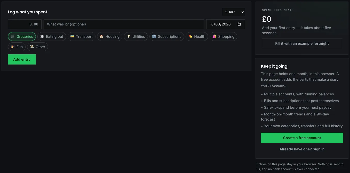
Accounts come first. At minimum, the current account your day-to-day spending leaves from; add savings accounts and credit cards if you want balances to be accurate. Each account needs an opening balance, meaning whatever it holds on the day you start. Do not backfill months of history. It is tedious, and nobody does it twice.
Categories arrive with sensible defaults, and the temptation to build thirty of your own is worth resisting. Categories exist to answer one question, "what is eating my money" (the same question the ONS family spending survey asks of the whole country), and eight good buckets answer it far better than thirty precise ones you stop maintaining after a fortnight.
Bills and subscriptions are the part that pays for itself. Anything that recurs (rent, council tax, energy, streaming, the gym) gets an amount, a cycle and a day, and together they power the single most useful number in the app.
Safe to spend
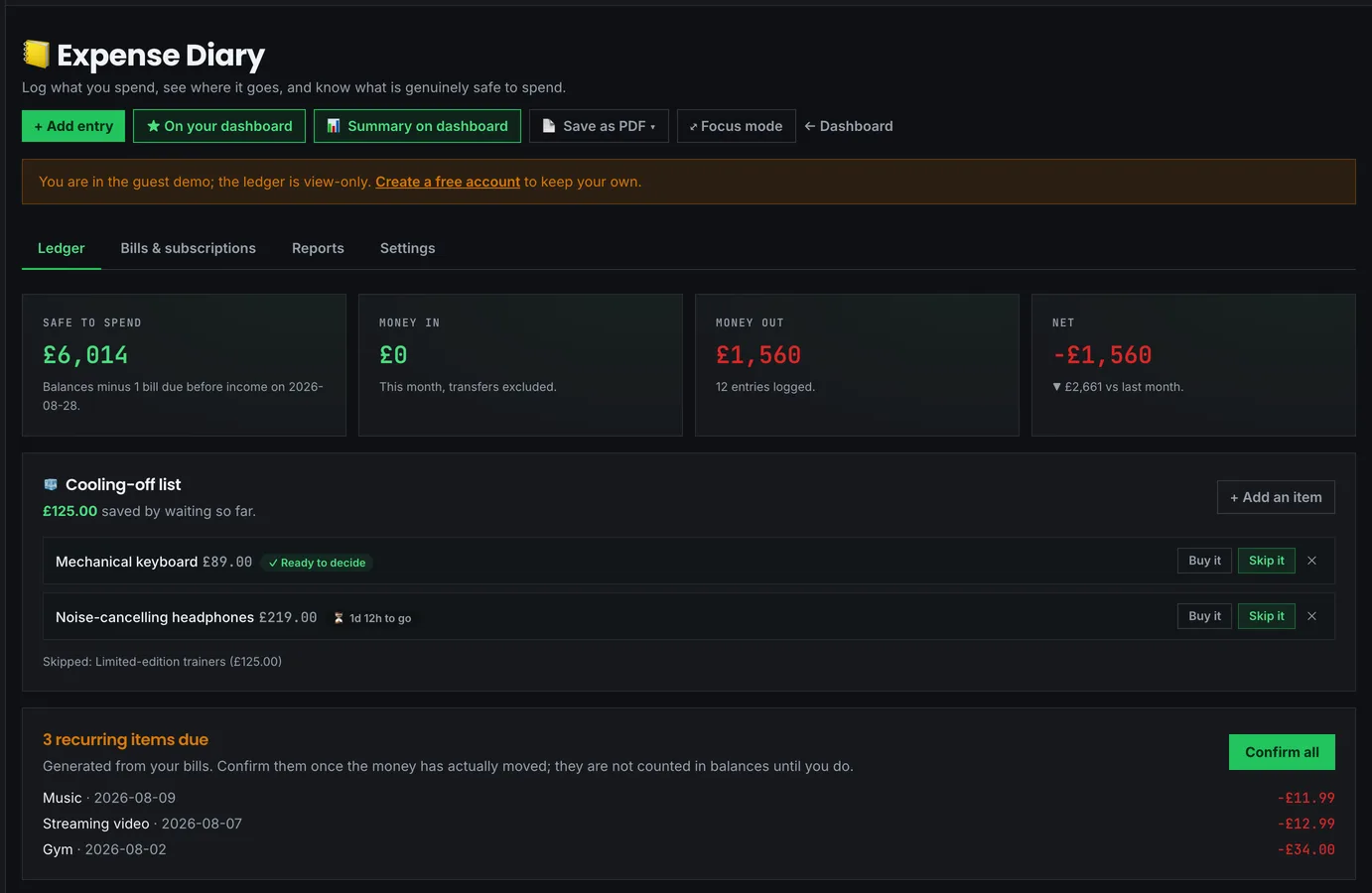
That number is the headline figure, and it is not your balance. It is your balance minus every bill falling due before your next pay date.
The distinction is the whole point. Your account might say £900 with a week to go, which feels comfortable until £600 of rent and direct debits land on Friday. The diary does the subtraction for you and reports the honest number: £300. Spend against that, not against whatever your banking app shows.
It only works if your recurring items are complete, though. A missing £70 direct debit means a safe-to-spend figure that is £70 too generous, every single month, and you will feel that on the same Friday each time.
Four seconds per entry
An entry is an amount, a category, a date, and an optional note. The date defaults to today and the account to your main one, so most entries are two taps and a number.
The note field feels pointless at the time. Fill it in anyway. It is the difference between a report that says "Groceries, £312" and one that tells you £180 of that was the weekly shop while £132 was six late-evening top-up trips, which is the version you can actually act on. The Most spent on report groups by exactly this text, matching case-insensitively, so "Tesco" and "tesco " count as the same place.
Log the same day, too, not at the weekend. A Saturday catch-up session turns into a chore, and a chore turns into an abandoned app. Four seconds after paying is sustainable; forty minutes on Sunday is not.
Pending until you confirm it
When a recurring item's date arrives, it appears as a pending entry, and it is not counted in your balances until you confirm it.
This two-step is deliberate, because a bill you expected and a bill that actually left your account are different facts. Direct debits fail. Subscriptions change price. Annual charges arrive on a different day than last year. Confirming is your check that reality matched the plan, and Confirm all clears the lot in one go when it did.
What the reports actually compare
The Reports tab covers one month at a time, chosen with the selector at the top: arrows, a dropdown, or a tap on any bar in the month-by-month chart.
How the month is going shows your daily rate and where the month lands if you carry on at it. On the 18th of a 31-day month, spending £84 a day projects to £2,604. A projection, not a prediction; it assumes the rest of the month resembles the part you have lived.
Your logging habit tracks consecutive days with an entry, no-spend days, and how many days you have recorded anything at all. A no-spend day is genuinely worth counting. Several apps have found it to be the metric people most enjoy watching go up.
Where the month went ranks categories by spend, with an arrow showing the change against the same stretch of last month. That "same stretch" matters more than it sounds: comparing 18 days of this month against a complete previous month makes everything look like an improvement, which is a calendar effect rather than a saving, so every comparison in the reports truncates the earlier month to the same day.
What changed ranks the biggest movements between the two months, including categories you spent nothing on in one of them. Stopping something entirely is the most interesting kind of change there is, and it would be invisible otherwise.
Which days cost the most adds up every Monday, every Tuesday and so on. Bills are excluded by default, because a single rent payment is larger than a fortnight of everything else and would otherwise be the only thing the chart showed.
Putting it on your dashboard
The Summary on dashboard button, next to Add to dashboard, puts this month's figures on your dashboard: safe to spend, money in and out, your top three categories and a prompt if you have not logged today.
The two buttons are separate on purpose. Add to dashboard places a shortcut; Summary on dashboard places your actual spending. On a shared laptop that difference is the entire question, so neither implies the other.
When the numbers look wrong
Nearly every "safe to spend looks wrong" report traces back to a missing recurring item or an account whose opening balance was never set, so check the Bills tab first. If the totals look doubled, suspect a transfer logged as an expense: moving money between your own accounts is recorded as a transfer and excluded from both income and spending, so it should never inflate anything. And if a good month ends with a broken streak, remember the streak counts days with any entry, so a spend-free day only survives if you log it. That is what the catch-up's "nothing spent" option is for: it records the day as a deliberate zero, which keeps the streak alive, counts toward your no-spend days, and stays out of every money figure.
What the data buys you later
Once you have two or three real months, your spending total becomes the single most valuable input you own. Bring it to the 50/30/20 budget planner to see how your split compares to the guideline, or to the FIRE calculator, where retirement spending drives the entire target pot. A FIRE number built on a guess is a guess; one built on a year of logged entries is worth planning around.
Your entries never leave your account, and Export ledger gives you the whole thing as JSON whenever you want it.